
4. Our website needed an overhaul.
When we began this endeavor, our website was more than six years old. While that’s not ancient when it comes to the web, it had some critical features that needed to be reworked or completely overhauled. And when that level of work is required, it’s often better to start fresh. Plus, our old site no longer felt consistent with web design best practices of today.
There was a point where we considered keeping the previous branding and simply updating the website. But it wasn’t long before we realized that everything needed to be completely refreshed.
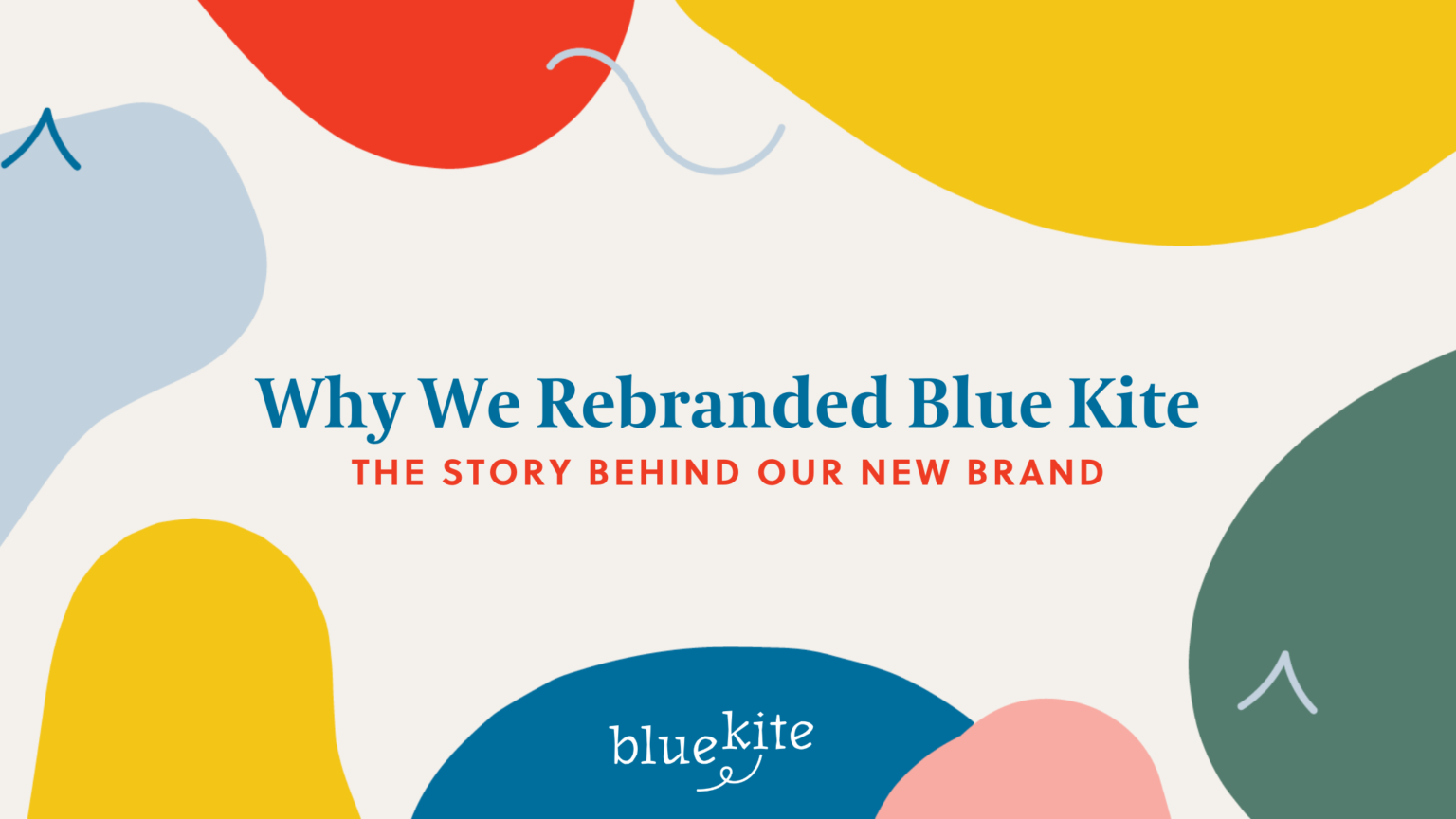
How We Approached Our Rebranding
Rebranding is not just about a new logo. It’s about more clearly defining your brand strategy and then building an entire brand identity that reflects that.
Just like we do with clients, we started by building the strategy first. Once we had revised our strategic direction, updated our mission, vision, values and key positioning, we partnered with our friends at Honey Creative to build our new brand identity.
They took our strategy and creative direction to create a design palette and mood board that reflected our style––elegant, elevated, bold, confident and fun.Together, we also opted for a brand pattern instead of a brand icon. The idea being to make our imagery less literal and more engaging and energetic to better reflect our brand strategy process. 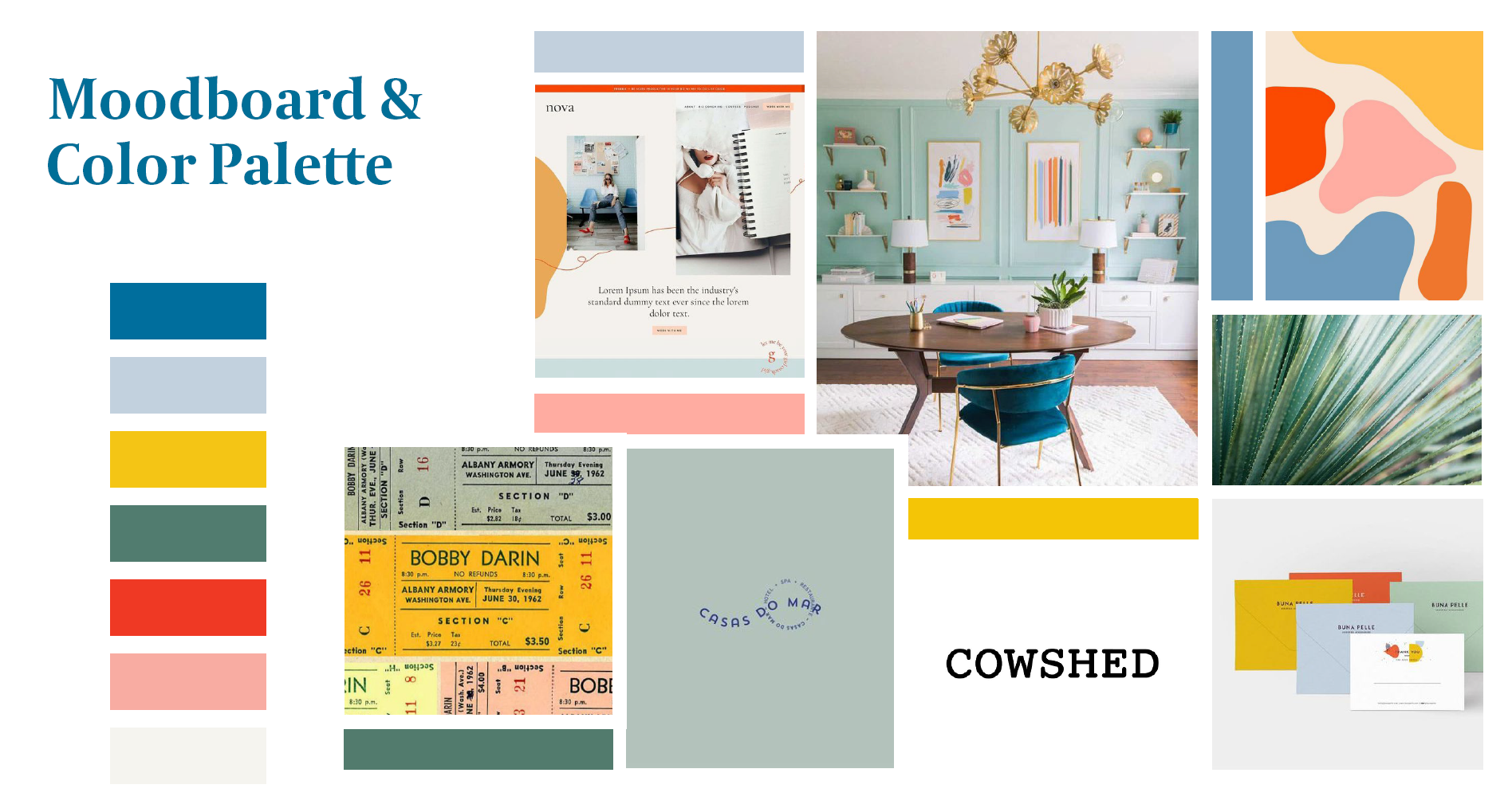 From there, the Honey Creative team built out the identity. We love partnering with them because they are thoughtful and strategic about every little choice.
The font.
The typeface was chosen, in part, by the story behind its development. It was created in 1990 using entirely straight lines to solve screen display problems of the era. This gives a nod to Blue Kite’s creative problem solving chops. And stylistically, it feels classic, yet creative––which describes us to a tee!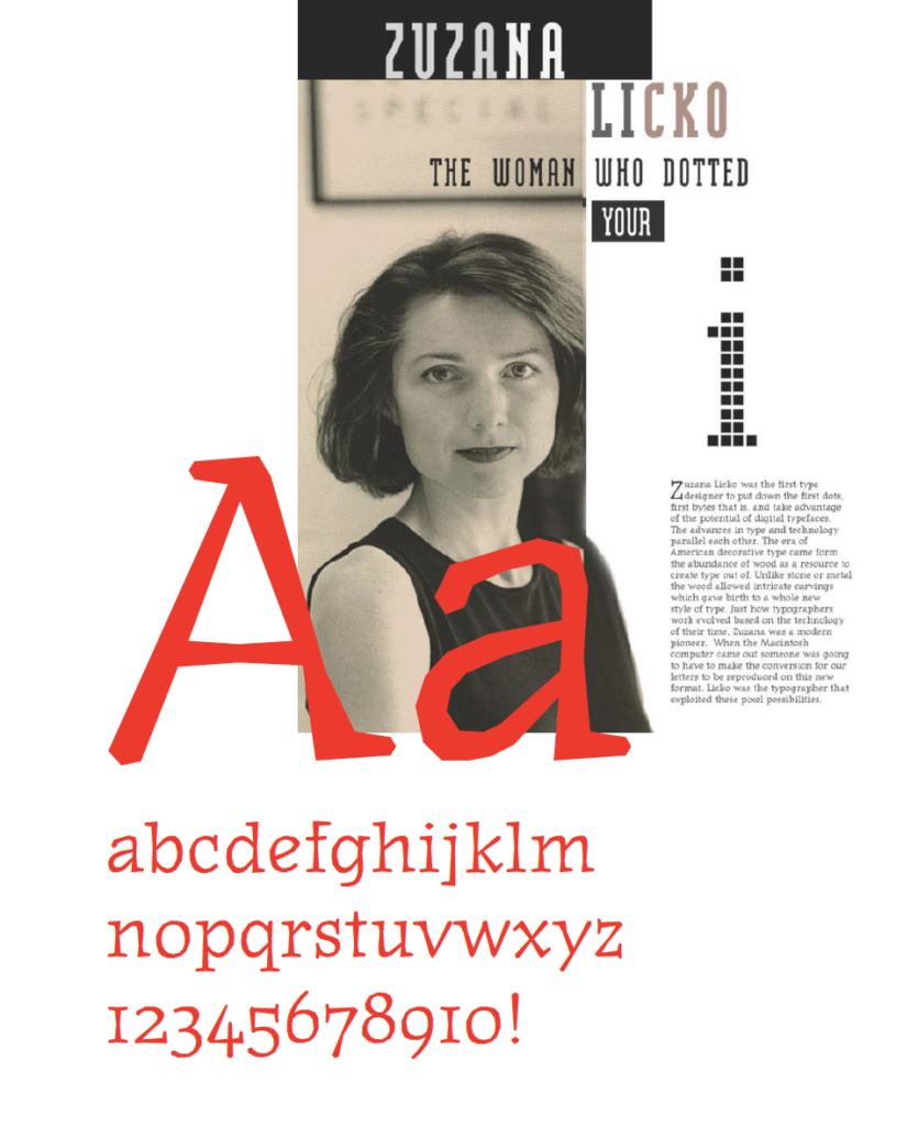
The colors.
We notched up our color palette to be more creative and artistic, while still giving off an elegant feel.
The design.
The word “kite” was elevated to give a nod to our goal of helping organizations elevate their brand and ultimately reach new heights. The dot in the “i” gives a nod to the kite shape with the editor’s mark for deletion to serve as a tail to the kite. 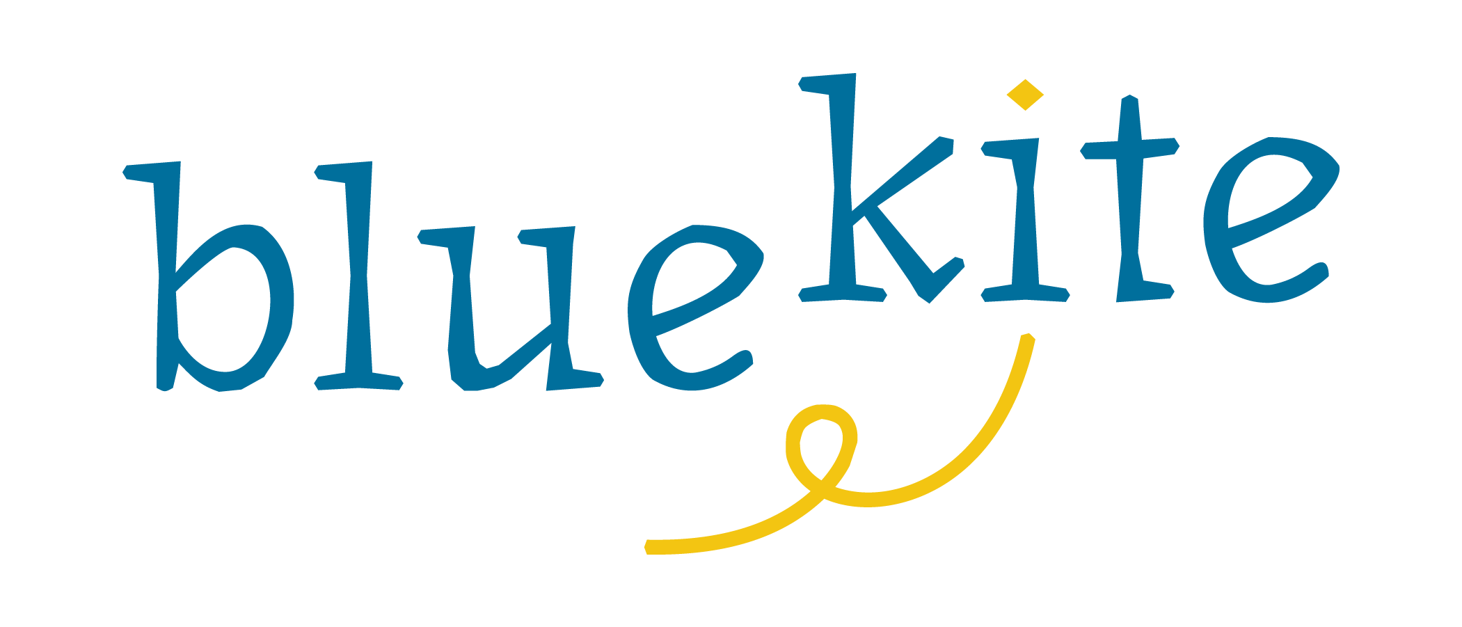
In addition to the primary version of the logo, we have an alternate emblem and simplified typography-only version to give us flexibility across multiple media and formats.
![]()
The pattern.
In addition to the organic shapes, the design includes editor’s marks. This is a subtle nod to my background in journalism, while also invoking the imagery of a kite string. Once the brand identity was completed, we worked together to create the website and brand marketing materials to use to promote Blue Kite. The result is a striking and flexible brand identity package that works well for the web, print and social media.
 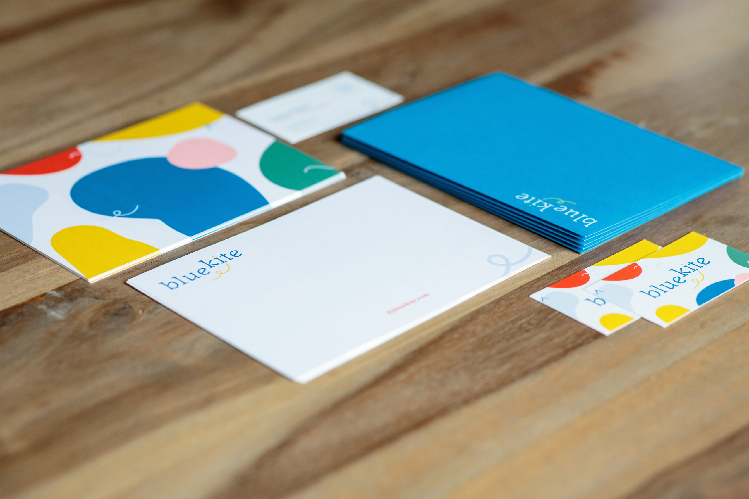 Now we finally have a brand that truly reflects who we are as a company and we’re excited to show it off to the world! We hope you love our new look as much as we do!
Implementing Your Brand
Once you’ve completed a rebrand, your job is not done! You have to make sure your brand is implemented consistently everywhere your business shows up.
Brand consistency is key to getting more awareness for your business. Download our free brand implementation checklist below to make sure you have a cohesive identity that represents your business in the best way possible!


One reply on “Why We Rebranded Blue Kite and How We Did It”
I liked this read on rebranding. I am looking forward to the list.