Monroe Harding made changes to their philosophy of care for the children they served. As a result, they experienced dramatic staff changes and a huge culture shift within the organization. Everything about the organization had changed––except their messaging and branding. On top of that, Monroe Harding struggled with brand confusion with other similarly named organizations in the area. They wanted a brand that better reflected their story and mission.
Our Approach:
Based on thorough research of all of their constituents––staff, foster parents, donors, volunteers and board members––we determined that a name change was not needed, but instead, we opted for a stronger tagline to better convey the work they do.
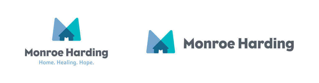
We also updated their logo to reflect their energy and work. We used overlapping shapes in the “M” to create the image of a house and an upward arrow. These symbols represent the growth and positive impact Monroe Harding has on a child’s life, while also placing an emphasis on their work to provide homes for children.
The result:
“Monroe Harding chose Blue Kite to help our nonprofit foster care organization with a rebranding effort. Blue Kite was very thoughtful and thorough in learning about our mission and the children, young adults and families we serve. They brought their dynamic perspective to our marketing effort, including a fresh new logo, strategies for connecting with a wider audience, and targeted marketing for foster parents. We appreciate all the work and care that Laura and her team put into helping us strengthen our messaging and brand awareness in Nashville and beyond!”