We don’t write about ourselves very often here — we try to keep the focus on ways we can help you can better market your business.
However, it
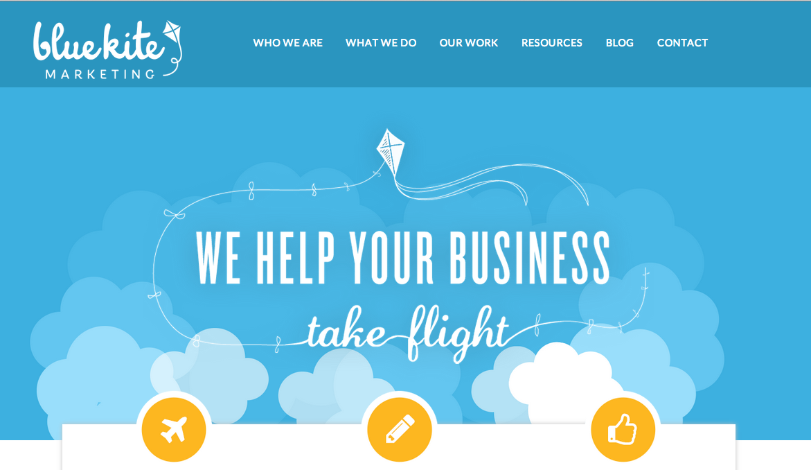
you haven’t noticed, we’ve got some new digs at Blue Kite Marketing!
While our old site had served us well for almost four years, it was high time we freshened things up around here.
I’m so excited about our new site and wanted to take the opportunity to share some of the things that make this site a much better experience for YOU. We hope you see the difference!
Key Features of our New Website
Here are some of the things we think you’ll love most about our new website:
1. It’s beautiful!
I can’t help but gush about the design of the new site. It’s gorgeous!
We refreshed our logo and built a new site that is bright, cheerful and fun — all things that are very representative of our brand.
I love everything from the moving parallax clouds in the background to the sunny yellow buttons to the clean, current design. We hope you love it as much as I do.
2. Meet our team.
If you’ve been reading the blog in recent weeks, you may have noticed some new faces here — Jan Morrison and Danielle Ali.
Although they’ve been a part of the Blue Kite Marketing team for a while now, they didn’t have a proper spot on the website. Now they do.
I encourage you to learn more about them and connect with them on social channels. They are super! And, I couldn’t be more thrilled to have them on the team.
3. It’s optimized for mobile devices.
Our old site wasn’t great on mobile devices. And with nearly 30 percent of our visitors using tablets or mobile devices, it became critical that we improve the mobile experience.
Not to mention, it’s high time we practice what we preach with our clients — you must consider the mobile experience. That’s why this site is mobile responsive. The site detects what type of device you are using and delivers the content up in just the right size.
If you haven’t tried the site on a mobile device yet, take a look and let us know what you think!
4. Get free marketing resources!
We’ve created an entire section of the site devoted to sharing free marketing resources, such as eBooks and worksheets.
For instance, did you see the free eBook we launched earlier this week? If not, check our 5 Step Guide to Creating a Simple Social Media Plan.
We will be beefing this section of the site up considerably, so check back there to see what we’ve got up our sleeves.
Or even better, sign up for our Liftoff eLetter and you’ll be the first to know when we’ve got new freebies available.
5. See our work. Finally.
We share work samples with prospective clients, but we wanted to make our work more prominent. We are proud of our clients and the work we do. So, we wanted to do a much better job of showing it off.
Check out our work section to see case studies about the work we’ve done and hear from our clients about their experience with us.
6. More in-depth information about what we do.
Our old site didn’t do a great job of sharing information about what we do. We wanted to give folks a better picture of how you can work with us.
Check out what we do to get an in-depth look at the services we offer and how we might be able to help your business.
What do you think?
We want to thank our partners, S2N Design and AhSo Designs, for their work on our site. We’re thrilled with the result!
We’re still working on fine-tuning pieces of the site, but we’re so excited to finally share this new design with the world!
What do you think of the site? Let us know in the comments. We’d love to get your feedback and see if there are ways we can continue to improve the new site.


