
This post is the first in a new series from the Blue Kite Marketing team, #BKPicks, in which
we round up some of our all-time
favorites.
Recently, I have been helping a small non-profit arts organization aimed at children to develop a new logo. We looked at the logos of other similar organizations and realized that we hated them all because they all looked the same — they all have hands, stick people, globes or rainbows.
We wanted to be different, yet still speak to our target audience. We haven’t finalized our new design yet, so I can’t reveal the details.
During the process, though, I had to answer this question from everyone at the organization:
What makes a good logo?
A good logo meets a few basic criteria:
- It must speak to your target audience and communicate something about your brand.
- It should look good in various formats — single color (black), four-color and a negative.
- It should be simple enough to be scaled down to a small size.
- It should be easily recognizable and memorable.
Once those criteria are met, it’s all about originality, creativity, feel and all the other objective elements that are hard to quantify.
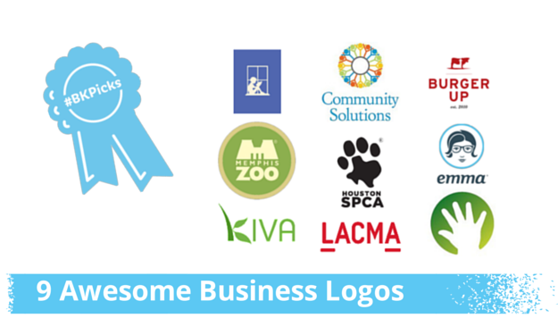
Our Favorite Company Logos & What Makes Them Worth Emulating
Today, we’re featuring three favorite logos from each member of the Blue Kite Marketing Team with an explanation about what makes them great.
Danielle’s Picks
Pottery Barn Kids
What I love about their logo is that they actually have
nine
logos in a sense! Blogger Mindy Gayer beautifully displays the silhouettes the company uses in their branding, and
articulates what’s so special about Pottery Barn Kids brand identity. 
Silhouettes are a time-honored way of capturing images of children, so it’s a perfect fit for an upscale, classic brand. PBKids put a twist on the convention, though, showing the sweet and silly side of a busy child.
The sophisticated color palette and traditional typography perfectly offset the whimsical images and make for an iconic brand that says “lighthearted luxury,” not “kid stuff.” And what’s impressive is that I’ll bet anyone in their target audience (including me!) recognizes any of these nine logos instantly without the need for the brand name Pottery Barn Kids alongside it.
Kiva
I’m a sucker for logos that creatively represent the letters of their brand name. I just always remember brands that use this approach! Kiva
get bonus points if the design isn’t just pretty, but tells their company story too.
 Kiva’s logo is simple but the green leaves of the “K” clearly tell you that this brand is about fostering growth.
Kiva’s mission is “to connect people through lending to alleviate poverty.”
Sometimes Kiva’s logo appears as a part of the full name, and sometimes simply the leafy “K.” It works both ways seamlessly because the brand name is a natural extension of, and completely integrated with, their logo. The leaves and branches motif is carried through their website branding, too, without being hokey.
Memphis Zoo
If you’ve ever been to the Memphis Zoo yourself, you know that
the entrance is pretty distinctive. It is cleverly mirrored in the zoo’s logo. It also does double duty of subtly conveying an “M” (as in Memphis) — one of my favorite logo tactics! I like that it’s a departure from the 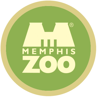 expected depiction of an animal.
What’s great about this logo, though, is that the clean lines of the fonts and the soothing colors position the zoo as modern and inviting — not what you always think of when you think of a zoo! That’s some solid strategy to entice visitors who may associate the zoo with loud noises and garish colors.
Jan’s Picks
Houston SPCA
I saw Houston SPCA’s logo during a recent trip back home to visit my family in Texas, and loved the simplicity and straightforwardness of it. It ties together images — an animal paw and the state of Texas — that illustrate two elements of the organization’s mission — animal welfare and Houston.
![]() It would be hard to incorporate an image that screams “Houston” because the city doesn’t have one instantly recognizable landmark like the St. Louis Arch or the Seattle Space Needle. But everyone knows what Texas looks like, which makes it instantly recognizable.
It would be hard to incorporate an image that screams “Houston” because the city doesn’t have one instantly recognizable landmark like the St. Louis Arch or the Seattle Space Needle. But everyone knows what Texas looks like, which makes it instantly recognizable.
Using an animal paw is perfect because it encompasses (almost) every species of animal served by the organization. The previous logo was too detailed and complicated with several different animals represented in the image. It didn’t meet some of the basic criteria outlined above.
Community Solutions Program
At first glance, the Community Solutions Program logo is a mosaic of lines and circles that come together to create a cute sun or perhaps flower. But upon closer examination, you’ll see that those lines and circles are little stick figure people with their hands up in the air. (Yes, there is a place for stick people!) Their stance makes them so optimistic and hopeful, and the variety of colors illustrates the diversity of the organization.
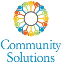 Before you know anything about the organization, you already have the impression that it is an optimistic organization full of diverse people who hope to improve the world. And you would be right!
While the logo gives a very distinct impression of the organization, the program name is another story altogether… Although I like this logo, I would encourage a new name that is just as optimistic as the logo.
Los Angeles County Museum of Art (LACMA)
This LACMA logo is instantly recognizable as I’m driving around Los Angeles, which is where I currently live.
![]() I like it for the same reasons I like the Houston SPCA logo. It illustrates the two most vital elements of the organization — art and Los Angeles.
I like it for the same reasons I like the Houston SPCA logo. It illustrates the two most vital elements of the organization — art and Los Angeles.
It’s artistic, without being too avant-garde, cartoony or obvious. It’s simple, easy to read and straightforward. The font is contemporary, but still accessible. The subtle lines under the first and last letters tie together the L and the A to form LA, because showcasing art that represents LA is a vital mission of LACMA.
Laura’s Picks
BurgerUp
Because I’m a bit of a foodie, I appreciate restaurants where the quality of the logo is on par with the food. And Burger Up in Nashville fits the bill.
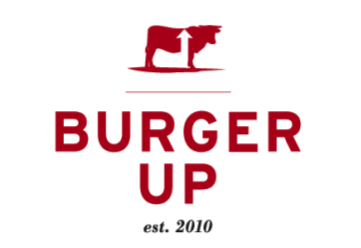 It’s an upscale burger place and the logo conveys that. They use an image of a cow, which represents the restaurant’s commitment to using locally sourced beef and ingredients.
The logo is also sleek, inherently simple and easily recognizable. If you show the image without the words, it still screams Burger Up. That, to me, is always the sign of a great logo.
Emma
Emma, a Nashville-based email marketing software company, has always been another favorite of mine.
First, their name is incredibly clever. It combines the first two letters of “email” and “marketing” to create a well-known first name, which ![]() instantly makes their business seem more personable.
instantly makes their business seem more personable.
Then, they created an image to match. Emma looks smart and stylish — everything you want your email software to be.
And, once again, without the name, the image itself is easily recognizable.
Children’s Hospital of Chicago
Years ago, I lived in the Chicago area and worked at a children’s charity. During that time, I always admired the Children’s Hospital of Chicago’s logo.
Their mark is a tiny hand enclosed in a colorful circle. The image reminds me of handprint paintings you see in classrooms, which makes you think about kids.
The image also looks like a hand being raised, which evokes the feeling of “yes, I’ll help.” That’s incredibly strong symbolism and a smart move from a fundraising perspective.
I also love the versatility of this logo. If you look throughout their web properties, multiple colors are used, giving the logo a childlike feel. But yet, it stays true to the design and the brand.
It also looks great scaled down because it’s so simple. If you check out their social media properties, the image looks still looks great and is easily recognizable at a tiny size.
What are your favorite logos? Share your picks in the comments — we’d love to see other great designs out there!


2 replies on “#BKPicks: 9 Awesome Business Logos & What Makes Them Great”
As a customer of Emma’s for many years, I never knew their logo stood for “EMail MArketing”. Huh, learn something new every day!
This post comes at a good time– I’ve had another article open on my desktop for a few days, pondering a “zigzag logo” courtesy of AdWeek, wondering who to share it with. What a perfect opportunity to share it here! FastCompany calls the logo “perfect”.
It’s for the Melbourne Squash Club. “Avoiding generic silhouettes of players or two crossed rackets, our inspiration comes from every thwack, thud, squeak and sneaky drop shot to form their unique club initial.”
Full article here: http://www.adweek.com/adfreak/zigzag-logo-looks-crazy-but-is-pretty-brilliant-160405
That is a crazy logo, Stephen. But, it really does seem to fit the brand. And, that’s what’s most important. Thanks for stopping by!